Card Centering: The Annoying 1mm That Can Cost You Hundreds
You know that feeling when you’re staring at a card and thinking, “This is totally a 10… right?” And then it comes back a 9 and you spend the next 48 hours squinting at the slab like it personally betrayed you?
Yeah. That’s usually centering.
And the rude part is this: we’re often talking about a one millimeter difference the kind of thing you wouldn’t notice unless you’re holding the card like it’s a tiny museum artifact. But that microscopic “meh” can be the difference between a PSA 10 and PSA 9, which on popular cards can mean $200-$500 (or more) just… evaporating.
Corners can be protected. Surfaces can be kept clean. But centering is baked in at the factory. You can’t “fix” it later. So if you’re grading (or buying raw like a gambler with hope in your heart), this is the stuff you need to understand.
Let’s make centering way less mysterious and way more predictable.
First: Do the “Eye Test” (aka Trust Your Gut… a Little)
Before you grab tools and start doing math like you’re filing taxes, do this:
Hold the card at arm’s length and ask yourself: Does the image look pulled to one side?
If yes, cool, you probably don’t need to measure. It’s off. Next card.
If it looks basically even, that’s when centering gets sneaky because the “borderline zone” is where grades (and money) go to play emotional games with you.
I sort cards like this all the time:
- Obviously off → don’t waste time measuring
- Looks pretty good → measure, because my eyes love lying to me
Why Centering Hurts So Much (Besides Emotionally)
Centering is one of the big four grading categories (with corners, edges, and surface). The difference is: you can baby a card into having sharp corners and a clean surface.
But if the factory cut shoved the image to the left like it’s trying to escape? That’s permanent.
Also: people buy with their eyes. A card can be crisp and clean, but if the borders look lopsided in a slab, buyers hesitate. Meanwhile a slightly imperfect corner with great centering often “looks” better and sells faster. Display appeal is real.
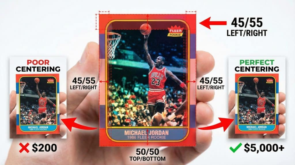
Centering Ratios: The Simple Explanation That Finally Clicked for Me
Centering is expressed as a split, like 55/45.
Here’s what that means:
- You measure the borders on one axis (left/right or top/bottom).
- Add them together.
- The bigger side is expressed as a percentage of the total.
So 55/45 means one side takes up 55% of the total border space on that axis, and the other side gets 45%.
And here’s the rule that makes people cry:
The worst side wins.
Graders check left/right and top/bottom, front and back. And your “centering grade” is basically limited by the worst ratio they find.
So if your card is:
- 52/48 left right (nice!)
- but 70/30 top bottom (yikes!)
…it’s treated like a 70/30 centering card. You don’t get to average your way into happiness. (Ask me how I know.)
Also: graders are usually stricter on the front than the back because the front is what everyone stares at forever.
What the Common Ratios Actually Look Like (In Real Life)
Here’s the quick mental picture version:
- 50/50: Unicorn perfect. More common on modern than vintage.
- 55/45: Still looks centered to most humans who don’t own a loupe.
- 60/40: You can usually spot it if you’re looking for it.
- 70/30: Obviously off. Like “why is it touching the border?” off.
- 80/20+: You’re now in “misprint vibes” territory.
The drama zone is 55/45 vs 60/40 because that’s where your eyes say “looks fine!” and your grade says “lol no.”
Grader Standards: Same Card, Different Company, Different Mood
This is where it gets spicy. A card can absolutely be a “top grade” candidate at one company and a grade lower at another, purely due to centering tolerance and grader costs and standards.
Here are the common benchmarks (always remember: companies can be a little inconsistent, and other flaws still matter):
PSA (the big marketplace bully)
- Gem Mint 10 front: 55/45
- Gem Mint 10 back: 75/25
- PSA 10s usually sell for the biggest premium, which is why people obsess.
BGS (the “let’s get specific” option)
- BGS 9.5 front: 55/45
- BGS 10 front: basically wants 50/50 vibes
- Back tolerance: around 70/30
- Half grades can be helpful if you’re hovering.
CGC (more forgiving on the front)
- Top grade front: 60/40
- Back tolerance: can go as far as 90/10 (yep)
- Translation: a card that misses PSA 10 on centering might still shine here.
SGC (often similar to PSA)
- Generally around ~55/45 front and ~75/25 back
- Strong reputation for vintage.
Ace (friendlier centering, different vibe)
- Often more tolerant (ex: 65/35 can still live as a Mint 9 situation)
- Useful for cards that would get clobbered elsewhere for OC.
My honest take: if your card is razor centered, PSA tends to reward you the most financially. If your card is close but not quite, you might want to think strategically instead of emotionally.
The 3 Ways I Check Centering (From Lazy to Nerdy)
1) A centering app (fast and shockingly helpful)
Apps like CenterGrade and similar tools can give you quick percentages from a photo.
Tips so it doesn’t give you garbage results:
- Take the photo straight on (no angles, no “artsy tilt”)
- Use a contrasting background
- Take the card out of the sleeve (I know, terrifying be careful)
- Works best on cards with clear borders (borderless designs are… not the moment)
Apps won’t catch surface scratches or print lines, but for centering math? Very handy.
2) The ruler method (classic, reliable, mildly annoying)
Measure the left and right borders (or top and bottom) in millimeters.
Then:
- Add them together
- Divide the smaller by the total
- Convert to a percentage
Example:
- Left border: 3mm
- Right border: 2mm
Total = 5mm
2 ÷ 5 = 0.40 → 40% / 60% → centering is 60/40
If you’re getting different numbers every time, that’s normal measure a couple times and average. (And maybe make some tea. This is not thrilling work.)
3) Centering overlay tools (great for sorting, not for “55/45 vs 56/44” drama)
Those transparent overlay cards are awesome when you’re going through stacks and just want a quick yes/no pile.
But if you’re trying to decide whether something is barely PSA 10 centering? Overlays can be a little too blunt. They’re more “good enough” than “surgical precision.”
The Sneaky Problem Nobody Talks About Enough: Image Tilt (Rotation)
Even if your borders measure beautifully, you can still get dinged if the image is slightly rotated like the whole frame is leaning.
I’ve seen cards that measure close to 50/50 but look weird because the printed image isn’t parallel to the card edges. And graders notice.
Quick check:
Put a straight edge along the printed frame (or a strong horizontal line in the design). Compare it to the card edge. If the gap gets bigger from one end to the other, you’ve got rotation.
This is one of those “but it looks fine?” issues that causes a lot of angry online posts. (Sometimes the card really is fine. Sometimes it’s rotated and your eyes just wanted to believe.)
Vintage vs Modern: Please Don’t Judge a 1989 Card Like It’s 2024
Centering expectations aren’t the same across eras.
- Vintage (roughly pre-2000): centering is often… adventurous. A 65/35 might actually be great for the set.
- Modern: manufacturing is generally tighter. People expect clean centering, and the market punishes obvious OC harder.
And that’s why well centered vintage in a top grade can be worth a small fortune: it’s legitimately harder to find.
OC Qualifiers + Diamond Cuts (The Weird Labels That Confuse Everyone)
OC (Off Center)
Sometimes a card is clean in every other way but is noticeably off center. In those cases, grading companies might use an OC qualifier instead of just dropping the number as far as you’d expect.
So you might see something like “Mint 9 OC” instead of a straight 7.
And honestly? Some collectors love OC cards because you can get high condition cardboard for less money if you can live with the lopsided look.
Diamond cut
This is different. A “diamond cut” is when the card is cut at an angle and ends up more like a parallelogram than a rectangle. That’s a cutting issue, not traditional centering. It’s also the kind of thing you can’t unsee once you spot it.
My Pre Submission Centering Checklist (So You Don’t Get Surprised)
Before you send anything off:
- Eye test first. If it’s clearly off, don’t waste time.
- Check front left/right AND top/bottom. Worst axis sets the ceiling.
- Flip it over. Back centering causes a lot of “wait, what??” grade reveals.
- Measure if it’s close. Photo + app or ruler math just pick one and be consistent.
- Check for tilt/rotation. Straight edge along a printed line/frame.
- Do a quick money gut check.
If your card is like 61/39 or worse and it’s a lower value raw card (say under ~$150), grading fees can easily eat your profit. Not always but often enough that you should do the math before you ship your hopes and dreams in a bubble mailer.
Measure First, Grade Smarter (and Save Yourself Some Heartburn)
Centering is one of those things that feels nitpicky until you realize how much it affects your grade and your wallet. The good news is you don’t need magic powers. You just need a repeatable grading process:
- eye test → measure the borderline ones
- check both axes, front and back
- watch for rotation
- and pick the grader whose standards actually match your card
Because guessing “it looks like a 10” is fun until you’re holding a 9 and pretending you’re totally fine about it.